Page Layout
Balance content and navigation
Because the Web is both communication medium and software application, Web designers are challenged with the task of providing both meaningful content and a functional interface—all in the small window of a Web page. With well-designed pages, design decisions are made in support of achieving an appropriate balance between content and navigation, based on the nature of the site and the needs of its users.
Current Web pages tend to emphasize interface over content. Page designs often contain four or more navigation systems: global navigation for quick access to the main sections of the site, local navigation for access to the pages or subsections within the current section, page navigation for access to the sections on the current page, and breadcrumb navigation to show where the current page lies in the overall structure of the site, just to name a few. The purpose of navigation systems is to reveal possible destinations and, at the same time, to allow users to easily traverse from section to section, and page to page.
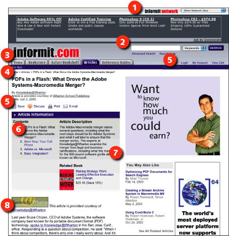
The primary rationale for navigation systems is that they minimize the number of clicks needed for users to reach their destination. For example, a clothing site might offer navigation links to all clothing categories, allowing users to go from "Shorts" to "Sweaters" in one click without having to backtrack to the home page (Figure 15.7).

Figure 15.7: Many sites provide extensive navigation options on every page so that users can easily move between sections. Here, Informit provides links to other sites in its network (1), site search (2), global navigation (3), breadcrumb navigation (4), utility links (5), local navigation (6), and links to related content (7). However, many of these options are extraneous for users who have reached their destination and want to focus on reading the article (8). www.informit.com
Pages with extensive navigation options suffer the same disease as many of today’s devices—feature creep. Feature creep occurs when features are added to a design because technically they can be added, and because they might be useful. The net result is a complex, multilayered device that is difficult to use. Link creep works the same way. When multiple links are added to a page just in case a user might want to go from a to b, the many users who don’t find those links relevant and useful are forced to work through a cluttered page to find the relevant link or information.
Navigation is certainly useful, but must be designed intelligently. Chances are a user shopping for shorts is not also shopping for sweaters, but instead sandals or swimsuits. Shoppers need ready access to account information and a shopping cart, but perhaps not information about the company or store locations. Navigation systems that are context-sensitive—that provide appropriate links based on content and available tasks—are more effective than extensive link lists covering every possible eventuality. Some backtracking is reasonable, particularly given that many users use the back button as their primary navigation device. Users who do want to go from "Shorts" to "Sweaters" can backtrack to "Men’s clothing" and go from there.
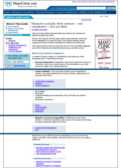
Minimizing navigation helps all users. Visual users aren’t overwhelmed or disoriented by unnecessary page elements. Nonvisual users do not have to work through elements that are irrelevant to the content of the page. And with contextual navigation, users have appropriate options on hand when they need them (Figure 15.8).

Figure 15.8: MayoClinic.com makes good use of contextual linking on its articles pages. In this article, each section is followed by links to other MayoClinic.com articles that relate to the information covered in the section. www.mayoclinic.com

