Text
Design pages that can accommodate different text sizes
Designing a Web page that is flexible and allows for customization is far more challenging than designing a static page. Fluidity is one of the most obvious differences: Print offers one view of a document; the Web offers any number of views.
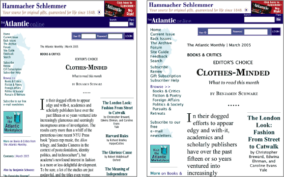
When we design page layouts that require pixel-level precision, and a user requires large text, we create a point of friction between the tool and the user. If we resolve this conflict by setting type so it cannot be resized, or by using graphic text, then some users will not be able to use the site. If text can be enlarged, but doing so sends the layout into disarray, then our design suffers, and users may not be able to make sense of the site (Figure 3.4).

Figure 3.4: Fixed-width layouts, such as those on the Atlantic, do not adapt well because the text columns do not adjust to accommodate text size changes. www.theatlantic.com
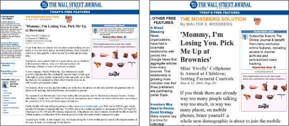
On the other hand, a well-crafted, flexible page can accommodate different text sizes while keeping its overall integrity. When users resize text, the page and column widths expand or collapse accordingly, but the overall design—the positioning of elements, and the relationships between elements—remains intact (Figure 3.5).

Figure 3.5: Flexible layouts, such as those on the Wall Street Journal, adapt to adjustments in type size. The columns resize and reflow when text is enlarged. online.wsj.com

