Layout Tables
Use flexible cell widths
In concept, Web pages are flexible documents that adapt to fit whatever method or device is used to access them. Type size is flexible: Users can adjust text to a comfortable size. Colors are adaptable: Users can define colors according to their needs and preferences. Page layouts are intended to be flexible so they expand or collapse to fit the users’ display.
In practice, many of these flexible elements are nailed into place using various coding strategies. One of these strategies is to use fixed measurements to define layout dimensions. Using pixels to define table and cell widths results in pages that will not reflow to fit different displays. This method gives designers control over aspects such as positioning, line length, and line wrapping. Unfortunately, fixed layouts constrain the power of the Web by producing documents that are designed for only one view. With so many different ways to access Web pages and possible adaptations that can be made, a single view of a Web page is simply not possible. Web pages must be flexible to accommodate different access methods.
With flexible layouts, designers have less control over page elements. For example, control over line length is less reliable in a flexible layout. Flexible pages viewed on a large display may have wide columns of text that are difficult to read, whereas a fixed-width layout allows designers to set line length at a comfortable measure.
One rationale for a fixed-width page comes from print design, where factors such as optimal line length are important. With a printed document, readers cannot adjust column width, which leaves it up to the designer to provide a text size and measure that is comfortable for "normal" readers (generally thought to be between 45 and 75 characters per line). Since the medium is fixed, however, the inevitable result is that readers who do not fit the norm will be unable to read the document.
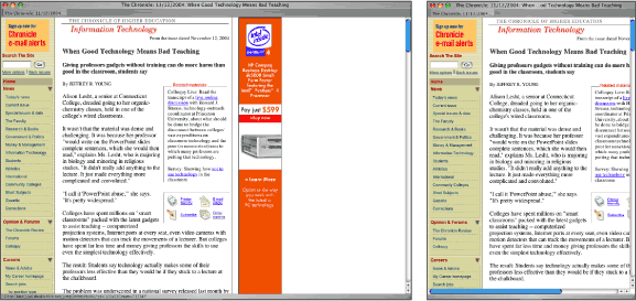
On the Web, print conventions can get in the way. With a fixed-width column, a 60-character line could become a 20-character line when a user enlarges text. Additionally, fixed-width pages are not adaptable. A fixed-width page on a large monitor makes use of only a portion of the available display area; on a small display, users may have to scroll horizontally to see the full contents of the page (Figure 6.7).

Figure 6.7: Fixed-width tables have the benefit of controlling aspects of the design, such as line length. However, fixed pages do not adapt to different window widths. Here, The Chronicle of Higher Education uses a fixed-width layout table for its pages. On a large display, a significant portion of the screen goes unused. On a small display, users must use the horizontal scroll to read the articles. www.chronicle.com
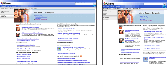
Flexibility is a fundamental attribute of Web pages and is necessary for universal access. Web pages must be flexible to work with different software and hardware, and to accommodate a range of user needs. Don’t try to restrain the inherent flexibility of Web pages through fixed layouts. Instead, use flexible layouts to build pages that adapt to different viewing conditions (Figure 6.8).

Figure 6.8: Microsoft uses flexible layout tables on some of its pages. The pages expand and collapse to fill the browser window. www.microsoft.com/windows/ie/community
To create a flexible layout table, use relative measurements to define cell widths. Relative measurements, such as percentages, will cause pages to adapt to different window widths. Assign cell widths using CSS, not HTML. Not only does this practice separate content and presentation, assigning table attributes in style sheets paves the way for a later conversion from table layout to CSS layout.

