Front Matter
Introduction
Design is a means to an end. We design things for a purpose. We design beds to sleep in. We design clocks to keep track of time. Our success at these activities (the end) depends on the design of the tools (the means). With good design, the tool fits the task so neatly that it becomes part of the task. Instead of using a bed, we sleep. Instead of using a clock, we check the time.
We build Web sites for many reasons, but one reason trumps all others: We build Web sites so people can use them. They are to be looked at, watched, listened to, skimmed, read, printed, clicked, input into, and operated by different people using different access devices. If the result of design is that someone cannot load a page or activate a link or read a paragraph or interpret an image, then design is no longer a means to an end—design is an impediment.
A functional basis for design
It wasn’t by observing buildings that architect Louis H. Sullivan arrived at the formula “form follows function.” It was by observing forms in nature.
“Whether it be the sweeping eagle in his flight, or the open apple-blossom, the toiling work-horse, the blithe swan, the branching oak, the winding stream at its base, the drifting clouds, over all the coursing sun, form ever follows function, and this is the law. Where function does not change form does not change. The granite rocks, the ever-brooding hills, remain for ages; the lightning lives, comes into shape, and dies in a twinkling.”
In his essay “The Tall Office Building Artistically Considered,” Sullivan asserts that the pervading law of nature should be the law of all things, built by man or nature.
Of course, nature does not build Web sites—people do. Sullivan would ask that Web designers hold as law that form follows function. To follow this dictum, we must first define in plain detail what a Web site is for, and examine the functions that the Web provides. Only by defining the function of the Web can we make appropriate decisions about its form.
Defining Function
When thinking about function, we tend to focus on the function of the site we are designing—selling books, publishing texts, building community—rather than on the functions of the Web itself. Our decision making has more to do with information structure, visual design, and back-end technologies than with basic functionality. We might say we have this focus because our design methods ensure a working Web site. Unfortunately, basic functionality is not a given. We all have experienced Web sites that look good and are well organized but that are nonfunctional on some basic level: forms that don’t submit, broken links, unreadable text. The fact is, the Web is broken at least part of the time for everyone who uses it. For people with special needs, the Web is broken much of the time. Our tendency to focus on the features of a site is part of the problem.
When we focus primarily on features, we risk making choices that impair basic functionality and lead to nonfunctional sites. To design functional sites, we must understand the purpose and functions of the Web, and the attributes that make it something that people can use.
To define function we must first identify our audience.
Who (or what) is the audience for Web pages?
In the most abstract sense, we build Web pages so that computers can read them. The software that people use to access Web pages is what “reads” the document. How the page is rendered depends on the type of software being used. A visual browser, such as Netscape or Safari, will render pages with images and complex layouts. A text-only browser, such as Lynx, will render only the text and minimal formatting. A talking browser, such as Home Page Reader, speaks the contents of a Web page. There are other types of software that read Web pages: Email harvesting programs read Web pages to extract email addresses; search-engine software reads pages to place them in a Web page catalog. When considered in the broadest sense, our primary audience is computers. Our Web pages must be usable by computers.
Of course, people use computers, and as we work our way from the general to the specific we are concerned with two types of users: visual and nonvisual. Visual users are those who use the Web by viewing pages on some sort of display device; nonvisual users hear them read aloud or interface with the underlying code. According to this definition, nonvisual users include software applications—such as Google.
So our most general definition of audience includes the following:
- Visual users: look at visually rendered Web pages.
- Nonvisual users: hear pages read aloud or read the underlying code.
If we sharpen our focus, we see important subdivisions within these categories: Software that reads what? Email addresses? Page content? Structural information? People who look at pages on what? Paper? A cell phone? A large display monitor? People who hear pages read aloud why? Because they can’t see? Because they understand the content better that way? Because they are occupied, for example, driving a car?
These subcategories are important, and we will discuss them as we delve into the specifics of Web page elements. For now, in the spirit of simplicity and clarity, these broad audience categories will serve us well as we turn to defining the functionality of Web sites.
What are the functions of Web pages?
Web pages provide two basic functions: communication and interaction.
Communication: People consume information on Web pages
Some Web content is static and is meant to be ingested by the user. For example, a product page, containing a paragraph about the product and a product photo, is intended to communicate information about the product (Figure 1). When successful, the user ends up knowing more about the product—what it is and what it looks like.
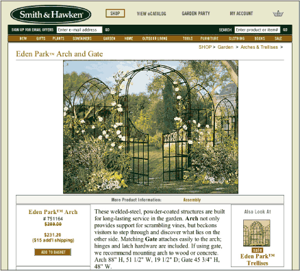
Figure 1: The Smith & Hawken site is informative and interactive—users can learn about and purchase products. For universal usability, the information must be accessible and the interactive features must be functional and operable. www.smithandhawken.com
The purpose of the description is to tell people about the product. Since the description is textual, the text must, above all, be perceivable by the user. It must be clear to the user that there is text on the page. For visual users, the text must be readable. For nonvisual users, text must be machine-friendly so it can be read well by software.
The purpose of the photo is to show people what the product looks like. For the photo to fulfill its purpose, it must be perceivable—people must know that there is a photo on the page, and that it is a photo of the product. However, the purpose of the image is to convey the visual properties of the product. To fulfill its purpose, the image must be interpretable. Visual users need to be able to view the image well enough to see its visual properties. Nonvisual users will not be able to see the image and will need the description of visual properties in a text format.
For content whose primary function is to be communicated to the user, the most important attribute is accessibility. For communication to occur, all elements must be available and accessible to the user.
Interaction: People work with Web pages
Other Web content is intended for interaction. Take, for example, a text link to a complete product description. The text of the link is both informative and functional. The link needs to be identified as a link, needs to communicate its destination, and, on activation, needs to move the user to the designated page. A functional link transports the user successfully from one page to another.
In addition to being accessible, interactive Web content must be functional. If a user does not recognize a link, cannot activate a link, or cannot reach the target page, the conditions of a link are not met.
So the basic functions of Web pages, in priority order, are
- Communication: Web pages communicate information. The important condition for communication is accessibility.
- Interaction: Web pages support user interaction. The important condition for interaction to occur is functionality.
What are the attributes of the Web?
Having defined the basic functions of the Web, we will consider the attributes that enable those functions.
Text-based: The Web is universal because it is powered by text
Text is the lingua franca of computer technologies because text can be read and “understood” by computers. In other words, software reads and performs actions based on text commands.
Web browser software performs certain actions based on the text it reads in Web documents. When reading text contained within a title tag, the software displays the text in the window title bar of the browser window. When reading text within the body tag, the software displays the text in the browser window. On encountering an image tag, the software retrieves the image file and displays the image in the appropriate location on the page.
With basic text, the computer can readily read and render a document. This rendering can vary depending on the environment. Browser software adapts its display to different display devices. Some browser software renders only the text in a document, ignoring visual elements and layout. Some browser software uses text-to-speech technology to read Web pages aloud. When people interact with browser software using spoken commands, the software converts spoken speech to text so the browser can respond appropriately.
When Web content is presented as text, communication can occur.
Structured: The Web is smart because of document structure
Software can read text but cannot attribute meaning without additional information. Document structure supplies meaning through tags that provide defining information for key document elements. Then, when reading, software can interpret certain aspects of a document. For example, if a phrase is tagged as the primary heading of an article, software can determine what the article is about.
When software has a way of deriving meaning, it can do far more than with text alone. Think about the functions of a search engine. If search engine software could only read text, a search for pages about the “tufted titmouse” would return all pages that contain those words, at best listed in order of frequency. With structured text, the software can find documents that are about the tufted titmouse because those words appear in the TITLE and/or H1 tag.
Standard browser software also makes use of structural codes, such as the document title. If a phrase is marked as TITLE, then software makes the assumption that the phrase identifies the document and should appear in the window title and the bookmarks list.
Software that reads Web pages aloud can communicate more information with structured text than with plain text. Many documents provide visual cues to communicate emphasis and document structure, such as italicized words and section headings. Screen reader software cannot know why a word or phrase is italicized or bold. Is it a heading? Is it emphasis? Is it a citation? Hence, these visual cues are not communicated by screen reader software. When reading a structured document, a screen reader can use audible emphasis to communicate structure to the user. Emphasis can be conveyed through a change in inflection, and document structure through sounds and inflection: for example, through a beep and slowed reading.
When Web content is structured, meaningful communication can occur.
Operable: The Web is interactive because it has working parts
Web pages are not merely for consumption. People operate Web pages. For the Web to be interactive, its functional parts must be in working order.
To work a Web page, we operate some sort of input device—either a pointing device like a mouse or a device that issues commands that are associated with the keyboard. Pointing devices are not usable by everyone. Some prefer to use the keyboard. Others find it difficult or impossible to work a mouse, or cannot see the screen to point and click.
On the other hand, keyboard commands can be issued using many different input devices. Commands can be input directly from the keyboard or by using spoken commands that activate keyboard actions. A variety of alternative input devices are available, and they all work by activating keyboard actions. Accordingly, all functional elements must be operable from the keyboard.
Clearly, operability is more than making sure all working parts are operable. They need to work properly and according to expectation. For instance, a link might be clickable, but if it leads to “Page not found,” it cannot be considered functional. A link that is embedded in an image may be operable, but if it cannot be seen and does not include alt-text that describes the target, then people who can’t see it won’t know where it leads.
When Web pages are operable and function according to expectations, interaction can occur.
Flexible: The Web is usable because users can control their experience
In the physical world, we can’t make a microwave easier to use by making the buttons larger, or shrink a book so it fits better in our handbag. Our experience of these objects is based on their design. On the other hand, some objects provide a measure of customization. As drivers, we can adjust the car seat and steering wheel to fit our size. Handbags and backpacks have adjustable straps. Since the marketplace is rife with goods, we can improve our experience by trying out different versions of the same thing. We might try several different styles of garden rakes, hiking boots, or toothbrushes, to find the one that suits us best. Or we might choose a style that has been designed to meet certain needs, such as large-print books.
When creating a fixed object, such as a book, the designer must make decisions about format—size, typeface, line length, etc. Since the aim is to create something that is usable by the largest number of people, these decisions must be based on what works best for the “average” person. In the case of a book, type size is generally set at a size that is comfortable for people with 20/20 vision.
Universal design is an approach to design that attempts to incorporate features that make things usable by more than just the “average” person. By anticipating the needs of all people, things can be designed in a way that makes them universally usable. In a public restroom, for example, the hand dryer and paper towel dispenser need to be used by standing adults, small children, and people in wheelchairs. Locating these features at a lower height makes then reachable by all.
The physical world is not an easy place to achieve universal usability. Most of what we see around us is fixed in form. For universal access and usability, one solution must address the needs of many. However, without the possibility of customization, the notion of one-size-fits-all means that someone has to compromise. For example, tall people might have difficulty using a paper towel dispenser that is located low enough for a wheelchair user. A truly universal design would adapt to meet the needs of each user.
The Web is an ideal medium for universal design. The stuff of the Web can adapt to meet the needs of each user. Much of the Web’s flexibility comes from its basic structure: Web content is flexible and device-independent. Because the Web is flexible and can be customized, the user is part of the design process and can make design decisions. For instance, although the Web designer makes decisions about format, the reader has the option to display text in whatever fashion he or she chooses. Printed text is generally read off a page; Web text can be read off a page, from a screen, by software, and so on.
Flexibility is also present in the way the Web functions. We can choose to interact with the Web’s operable elements (links, forms, menus, media controllers) using different methods, such as pointing and clicking, using the keyboard, touching the screen, or issuing spoken commands.
By separating content from form, the Web is also device-independent. In other words, its form is not necessarily what defines the user experience. Users can define their own experience through the devices they use to interact with the Web.
When Web pages are flexible and device-independent, communication and interaction can occur for more users.
Providing function
For universal usability, make Web pages text-based, structured, operable, and flexible. Although this directive sounds simple, Web sites rarely provide this most basic functionality. For example, Web sites commonly use images as links. To be functional, these links need to be accessible, which means image links need alternate text for people who can’t see them. Many Web sites do not provide alternate text for images. And even with alternate text, image links do not work for visual users who need large text for reading because images cannot be resized the way text can. Moreover, image links do not adapt as well as text to different window widths, which may affect people using small devices. Clearly, image links significantly impair functionality, yet they are a common element on many sites (Figure 2). How can this be? Because decisions about form often take precedence over function.
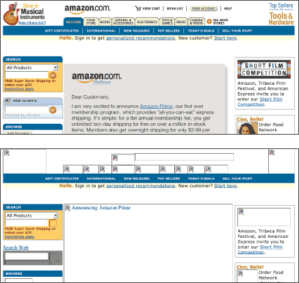
Figure 2: Amazon uses graphic text for links and content. Not all the graphic elements have alternate text; those that do have unhelpful alt-text. Users who cannot access image-based content and functionality may be unable to use the Amazon site. www.amazon.com
When it comes time to make design decisions about form, particularly with a device as complex as the Web, designers must compromise. In the example above, links should not appear as images because of functional considerations. However, we sometimes use images for links to enhance the appearance of a site: for example, to use a special typeface or type treatment that we cannot achieve using plain text. We might want to enforce a certain layout that people cannot resize or alter. In these cases, form and function are in conflict. If we use images as links, we get the form we are after but we sacrifice function. Some people will not be able to access and use our pages if we use image links.
Quality Web sites that are universally usable are not simple to design and build. But building quality sites is no more difficult than designing and building Web sites that are not good and not usable. Universal design is simply an approach to design, one that requires that we make intelligent decisions that honor and uphold the function of the Web.
Making informed decisions
We cannot build a Web site without making decisions about what colors to use, what fonts to use, how to lay out pages, how to label navigation. We may make decisions based on what we think works well in our experience of the Web. We may make decisions by emulating methods used on other sites. We may make decisions based on knowledge of best practices.
Regardless of method, somewhere along the way in the design process we will face a difficult decision, one whose effect ripples out to our other design choices. For example, we may decide to use a three-column fixed layout, even though it undermines the flexibility of our pages. When facing this type of decision, we need to determine whether the cost of a three-column layout is worth the benefit.
First, let’s look at the benefits of both approaches. One benefit of a multicolumn layout is visibility: more content can appear “above the fold.” Another benefit is readability, since fixed-width columns result in shorter lines of text. On the other hand, a flexible layout more gracefully accommodates modifications, such as enlarged type. Flexible pages also adapt to different display devices, from computer monitors to cell phones.
Now, let’s look at costs. The cost of using a fixed, three-column layout is high because such a layout affects the basic accessibility and usability of a site. People who need large type for reading or who view the Web on a small device like a cell phone will either be unable to use the site or significantly hindered by the layout (Figure 3).
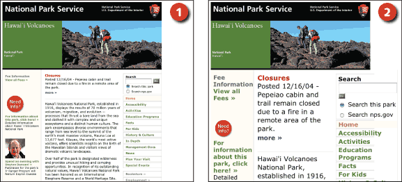
Figure 3: Fixed layouts, such as those used on the National Park Service site, do not adapt well to user modifications. The pages are attractive and usable when viewed on a standard display using a standard font size (1). However, the columns become narrow with enlarged text (2). www.nps.gov
The cost of not using a three-column fixed layout also affects usability, but in a less fundamental way. Some people might miss content if they do not scroll down to see what’s below the fold. People who view Web pages on large monitors might object to long lines of text (Figure 4).
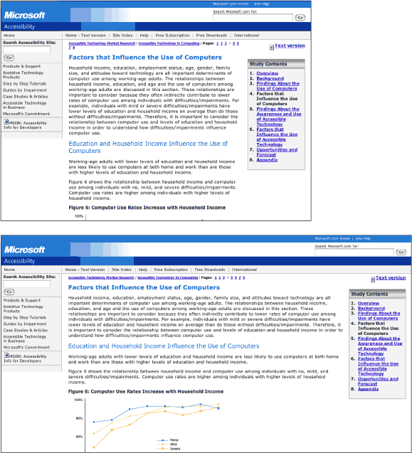
Figure 4: Flexible layouts, such as those on the Microsoft site, expand and collapse to fill the browser window. A flexible approach adapts well to different devices and to user modifications. However, users viewing flexible pages in a wide browser window may find the line length too long for comfortable reading. www.microsoft.com/enable/
Now, we could make this decision based on intuition about what is important or according to personal preference. However, it is far better to make a deliberate decision that honors and upholds the basic functionality of the Web. And since we have joined hands and agreed that our primary goal for creating a Web site is so people can use it, we will not compromise flexibility for visibility and readability because the benefit does not outweigh the cost.
Upholding the basic goals of access and usability simplifies the decision-making process significantly. Whenever the result of a design decision is that people cannot use our site, then other methods must be considered. In this case, a two-column flexible layout will meet our basic accessibility and usability goals while allowing more on-screen content and adjustable column widths.
Partnering with users
If we were to take a real-world approach to delivering a document to different users, we would provide a large-print version, an audio version, a high-contrast version, a text-only version—and still there would be people whose needs were not accommodated. In the physical world made of solid matter, it is impossible to create a thing, or even many versions of a thing, that works for everyone.
The Web provides a customizable interface to Web content. As long as the content is coded properly and designed to be flexible, users can change parameters, such as text size and color, and can use different software and devices to access Web pages. The result is that both designers and users are responsible for the design of Web pages. In a way, Web design is collaborative design. Designers send content to the user in a way that is flexible, operable, text-based, and structured; users, in turn, “redesign” the content to fit their needs and preferences.
Fixed design: Decisions based on rules and conventions
When graphic designers started working with the medium in the mid-1990s, we balked at the notion of collaboration. The rules and conventions of graphic design were established to enable effective communication. If users had the ability to change elements of a Web page, they might violate established conventions, and this was bad for communication. In response, our goal became to design pages that could not be customized by the user, to ensure design integrity and effective communication. We built pages with fixed elements—fixed-size text, graphic text, fixed column widths—that did not change size or reflow (Figure 5).
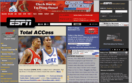
Figure 5: User modifications are difficult to accommodate when layouts are as complex as those used on the ESPN site. This type of design relies on pixel-level precision and requires the use of graphic text and fixed-width columns to ensure the integrity of the design. espn.go.com
With the advent of style sheets, we gained additional control over page elements: pixel-based sizing and positioning, leading, link formatting. Technologies such as Flash and PDF allowed us even more control over the look and feel of Web documents. Indeed, the Web gained popularity in part because it was more visually appealing than in its early, gawky days as a collection of hyperlinked text documents with scarcely any visual attributes. However, while gaining control of the user interface, we lost the active participation of the user.
In the physical world, whether we are designing razors, refrigerators, parks, or buildings, we must make decisions about how things look and how they operate. Generally, we make decisions based on a concept of what works best for the user. In user-centered design, users are consulted early and often in the design process. Established best practices are an effective source for determining what is in the best interests of the user. However, it’s impossible to make design decisions that work for everyone. The way to meet the needs of a diverse population is to allow users to make their own decisions about how things look and operate.
Transitioning roles to fit the medium
When new technologies are invented, we often apply proven methods, particularly when we see the new technology as compatible with existing methods. Problems arise when this approach causes us to make inappropriate use of the new technology. While compatibility can lead us to adopt a new idea, it can also lead to misadoption if we incorrectly interpret the intended use.
Designers are accustomed to controlling design in other information and communication technologies, such as film, print, and product design. The Web is yet another communication medium, so our initial approach was to control design in the same way by applying established design conventions. This was an instance of misadoption.
The trouble with imposing established conventions on the Web is that they undermine the strengths of the medium. In the words of Tim Berners-Lee, the inventor of the Web, “The power of the Web is in its universality.” When we impose a design on Web users and withhold their ability to control and customize their view, the Web becomes less universal because some people cannot use it.
For example, in order to support universal access, browsers display underlining as well as color to identify Web links. Underlining is essentially a fallback, so people who cannot distinguish color will still be able to identify links. However, underlining is considered vulgar in typographic design—a carryover from the days of the typewriter, when text styles such as italics were not readily available. There are good reasons to avoid underlines: they intersect text forms and clutter the page.
When graphic designers first started working with the Web, we objected to underlines because of their effect on legibility and readability. Asking people to read from the screen was bad enough without making them deal with underlines. However, we had little recourse since the user, not the designer, controlled the display of underlines. Though we could turn off underlining in our own browser preferences, we had to accept that our pages might or might not be displayed with links underlined. Then, with the adoption of style sheets, we gained the ability to remove link underlines, and there was much rejoicing. In today’s designs, links are often displayed without underlines.
The thing is, underlines are a rather useful method for identifying links, particularly for people who cannot see color. When underlining is turned off and there is no other method for identifying links, people who cannot distinguish link color from text color cannot easily identify links. A Web site without links is like a bicycle without wheels. When we impose conventions from print typography by removing link underlines, we take away one of the most essential Web functions—hyperlinks. And while users who object to link underlines have ready browser controls to remove them, users who need link underlines cannot easily put them back.
While misadoption can end in failure, it can also lead to movement away from old ways as the potential of the new medium is realized. In the early days of film, it took some time before filmmakers stopped filming staged action in the studio and began shooting live action in different locations. In recent years, we have started to reexamine our assessment of the purpose and use of the Web.
Initially, people accessed the Web using computers and standard display monitors, which allowed designers to predict to some degree how pages would be viewed. Today, with the proliferation of access devices and different “page” dimensions, we see the futility of trying to design a single page “view” (Figure 6).

Figure 6: Flexible sites, such as the HubbleSite, are not designed with one page size in mind. Instead, the pages are designed to adapt to different dimensions. www.hubblesite.org
Concerns about Web accessibility are being voiced through various channels. The Web presents opportunities for people with a great diversity of needs and preferences. Since Web content can be flexible and device-independent, the Web has great potential for people who have access or viewing requirements, use specialized software, possess old hardware and software, or have slow access to the Internet. Influential organizations like the World Wide Web Consortium are raising awareness about accessibility concerns through their Web Accessibility Initiative. Federal and local governments, organizations, and institutions are mandating Web accessibility.
All this focus on access and usability has given us the opportunity to reevaluate our role. We are accustomed to bearing responsibility for design decisions, but perhaps the Web asks something different of design. Should we continue to see ourselves as sole purveyors of design, and risk alienating users by our design decisions, or should we partner with users to build a Web that is accessible and usable by all?
Flexible design: A collaboration between design and user
Partnering with users requires two things: First, we have to design for transformation. Our pages must have flexible elements, and the overall design must hold up to change. Second, we need to recognize and respect the boundaries of the user domain.
Design for transformation means that designers must make decisions about the way Web pages are presented to the users while keeping those settings fluid so users have the ability to override settings and change elements without “breaking” the page. For example, users must be able to resize text without sending the layout into disarray. Users must be able to view pages on different display devices—large and small—and the layout must adapt gracefully. Pages must be designed using style sheets so users can override the designer settings with a custom style sheet. Pages must display well without visual formatting so users who do not use styles can still use the page (Figure 7). Content must be provided as text so users can suppress the display of images and still use the Web page.
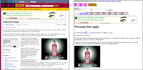
Figure 7: Wired uses style sheets to control formatting and to position elements on the page. Since content and visual design are separate, users who view the pages without styles can still access the content and functionality of the site. www.wired.com
Users have control over aspects of the Web environment. They control where the cursor is on the page, what links to click on, whether to reload a page, whether to use author-defined styles or their own, how to print pages, whether links open in a new window, whether images display, and so on. Web technology gives the designer control over some of these aspects. For example, we can move the cursor focus or force a page to reload. Sometimes we do enter the user domain in order to do something helpful, like place the cursor in the search field or update a page with dynamic information, like a stock quote. However, these helpful interventions can cause considerable confusion because they violate user expectations.
For example, designers often make links to external Web sites open in a new window. We do this for good purpose. One of the problems with hypertext is that, in clicking on link after link, people can easily get lost. The back button is commonly used to return to the originating site, but it has its flaws and does not always work according to expectation. To help users return to our site, we open links in a new window so users can easily close the ancillary window and return to our site.
The trouble with this approach is that many Web users have a two-pronged strategy for navigating the Web. They set out by following page links, and then use the back button to retrace their steps. When a link opens in a new window, the browser establishes a new history for that window. When it comes time to head back, clicking on the back button does not work, since the originating site is not in the history for that window. A user with only those two navigation methods—following links and using the back button—is stuck and without options.
However, users have the option of opening links in a new window—this functionality is part of the user domain. Should a user find this strategy useful, she or he can easily implement this approach using built-in browser controls (Figure 8).
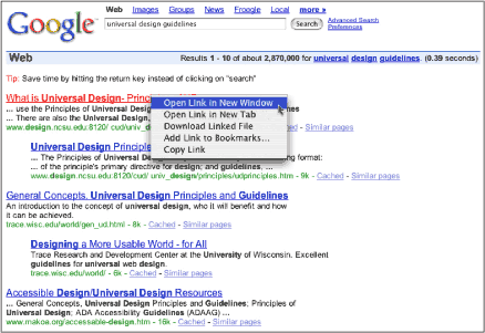
Figure 8: Browsers offer users the option of opening links in a new tab or window. www.google.com
This scenario represents another instance where the user cannot override a designer’s choice, but can implement it—an important distinction for collaborative design. If we remove link underlines so users don’t have to deal with clutter, users who need underlines can’t put them back. If we force links to open a new window, users who want to use the back button can’t make links open in the same window. If we refresh pages to display current content, users who want a static page can’t override the refresh. But users can manage all these actions—removing links, opening pages in a new window, refreshing pages—through their browser interface. When considering design choices that may cause problems for some users, we should step back and let users make their own decisions.
Summary
We design Web sites so people can use them. People doesn’t mean “some people” or “certain people.” With universal usability, our goal is to design Web sites that accommodate the diversity of people and the Web browsing devices that they use. To design Web sites that people can use, we must work within the flexible framework that the Web provides.
To this end, we must begin our process with a solid understanding of how the Web works. When we know its nature, we can make intelligent design decisions that uphold rather than impede its functionality. Whenever we face a decision that may impact function, we must look for other options.
No matter how well we uphold function, we cannot possibly design a Web site that meets the needs and preferences of every user. The only reason universal usability is a realistic goal for Web sites is because the Web is a flexible medium where designers and users share control of its design. With a working partnership, designers provide content that is well designed but flexible, and users adapt the design as necessary. To arrive at a successful collaboration, designers must assume less control and invite users to take more responsibility for their environment.