Color
Don’t use color alone to convey meaning
When color is used to enhance or enliven the visual display of a page, people who cannot access color will not necessarily suffer from reduced usability. They will still be able to access the materials on the site and to operate the site functions. However, when color is an integral part of the user interface, people who cannot access color may encounter difficulties. When color is used to convey information or to provide direction—as an indicator, to draw attention to interface elements or important text, and to provide status information—nonvisual users as well as some visual users will be affected.
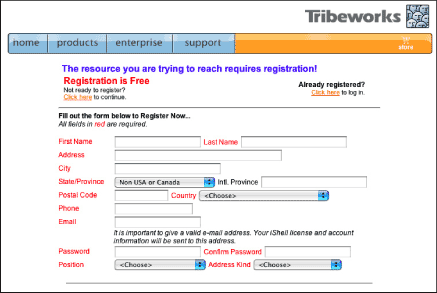
For example, required form fields are commonly identified using red text for the field label (Figure 11.3). Nonvisual users will not be able to identify required fields because the software reads the content of the page, not its visual characteristics. Visual users who cannot distinguish the color red will therefore not be able to identify required fields. Other examples include alert text displayed as red text, and colored buttons.

Figure 11.3: Tribeworks uses red text to label required form fields on its registration form. Users who cannot differentiate the colored labels from the other text labels will be unable to identify the required fields. www.tribeworks.com
As with other potential obstacles, the solution is not to eschew color. Color is an extremely effective method for creating emphasis and providing feedback—two essential aspects of a user interface. The solution is to provide redundant emphasis and feedback using other, accessible methods.
Links are a good model for this type of redundancy. On the Web, links have built-in visual attributes: color and underlines. Users who can see color can identify links by looking for colored text. Users who cannot distinguish colors can identify links by looking for underlined text. Because links are machine-readable, nonvisual users also have a means for identifying links. Screen readers distinguish links from other text by reading them using a different voice. Screen reader users can cycle through the links on a page using the tab key, access a list of links, and ask software to read only links. Software’s ability to recognize links is what allows search engines to rank pages based on link frequency.
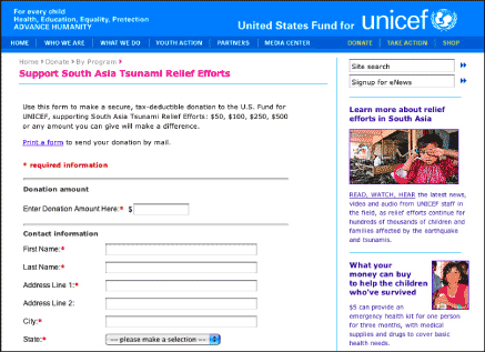
When using color to emphasize elements that do not have built-in redundancy, we need to take into account nonvisual users and visual users who cannot access color. The best way to design for these users is to provide emphasis using text as well as color. For example, instead of using color to identify required form fields, use color and an asterisk, and advise users that "Required fields are red and marked with an asterisk" (Figure 11.4). Instead of using color to highlight alert text, use color and text, such as "ALERT! Your username and password are incorrect." Rather than ask users to "Click the red button to continue," instruct users to "Click the Submit button to continue."

Figure 11.4: UNICEF uses a colored asterisk to identify required fields. The color makes the fields easy to identify for users who access color, and the asterisk can be identified and understood by all users. www.unicefusa.org

